A Minneapolis artist’s custom font, Times New Resistance, autocorrects Trump to ‘felon’ and ICE to ‘goon squad’
She describes it as a “social commentary meant to autocorrect the autocrats.”
Abby Haddican got tired of the rhetoric.
The Minneapolis-based artist can’t unsee the impact ICE and directives from President Donald Trump’s administration’s have had on her hometown in recent months.
“I don’t really know anyone whose life hasn’t been affected by the occupation in a tangible way,” she said. “Many people I know are volunteering to deliver meals, patrol schools, drive folks to work, and serve as peaceful observers — which is what both Renee Good and Alex Pretti were doing when they lost their lives at the hands of ICE agents."
The independent graphic designer thought about ways she could get involved when it hit her. She’s joining a larger tradition of subversive font design.
Haddican, whose work focuses on typography, branding, and packaging, thought back to Moontype, a font created by designer Olli Meier that autocorrects “bad words,” like hate, into “good words,” like love.
Then she thought about language and its use today.
“It’s become impossible to ignore how blatantly the Trump administration is misusing language in order to control and distort the narrative,” she said. It clicked.
“Wouldn’t it be cool if you could change someone else’s words?” Haddican said. “I decided that the best practical use of this font feature would be a practical joke.”
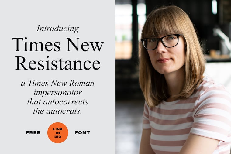
This month, she launched Times New Resistance, a parody of the commonly used Times New Roman font, which autocorrects a slew of specific words as they’re typed. Notably, Times New Roman is the new (and old) official font of the State Department.
Using Times New Resistance, the term ICE autocorrects to “the Goon Squad.” Trump autocorrects to “Donald Trump is a felon.” Gay becomes “gay rights are human rights.” Illegal alien becomes “human being.”
Kingsley Spencer, a creative director and designer based in Jacksonville, Fla., says using the State Department’s own font is part of what makes Haddican’s font so powerful.
“Using technology as a form of commentary against a political regime that decided to weaponize Times New Roman as a form of culture shaping is sharp for a designer,” he said. “I love how direct and comical it is.”
The font is free, “just like America used to be,” Haddican‘s website says. She said Monday that it has been downloaded about 600 times so far. She describes it as a “social commentary meant to autocorrect the autocrats.”
The hope is that some users might secretly install the font onto the computers of “an ICE apologist,” or “morally bankrupt American” as a way of unleashing mischief.
To the untrained eye, the typeface looks like Times New Roman in the font menu — there’s just a sneaky extra space between the words Times and New. But it’s likely many downloads are by like-minded supporters who want to enjoy the font for themselves.
The technology behind the font is simple.
Haddican modified an existing open-source typeface that resembles Times New Roman and programmed the substitutions. She said the hardest part was deciding which autocorrections to make.
“I know I’ve done an imperfect job. The corrections are a mixture of serious stuff (for example, the word ‘good’ autocorrects to ‘Renee Good was murdered by ICE’) and things that I find funny, like changing ‘Stephen Miller’ to ‘Nosferatu,’” she said.
“The first draft was significantly more profane, but I toned it down. I wanted to offend people by speaking truth to power, not for swearing like a sailor.”
Spencer said the font uses something in the typography world called ligatures, which replaces a set of recognized characters with a single character phrase. An example of this is when you type a fraction or date in a document and it’s automatically formatted.
Haddican joins a group of other typography artists who have made jokes, social commentary, or both through text.
Times Newer Roman is a typeface created by the Brooklyn-based art collective MSCHF (pronounced mischief) in 2018 that looks identical to Times New Roman, except each character is 5% to 10% longer, making essays appear slightly longer without changing formatting rules.
It was billed as a font that could help students cheat on term papers. The font takes jabs at academic productivity culture, using typographic invisibility that’s undetected by the untrained eye.
Sang Mun, a designer and former National Security Agency contractor, created a subversive “surveillance proof” font called ZXX in 2013. The fonts were created to be legible to the human eye, but difficult for surveillance software used by Google and other companies to scan text to read.
More mainstream examples include Shepard Fairey, the artist behind OBEY and President Barack Obama’s iconic HOPE graphic, who is known for his use of single phrases and high-contrast graphics to make political propaganda-style art. In the 2024 presidential election, Fairey made a Kamala Harris poster that said FORWARD in the same style as his Obama art.
» READ MORE: Artist behind Obama’s ‘Hope’ poster endorses Harris with her own graphic
On social media, reception for Haddican’s font has been strong, garnering over 6,000 likes on Instagram and hat tips from fellow designers.
“I think just about anything can be a form of resistance, and I believe that humor and playfulness are powerful tools for pushing back against oppression and authoritarianism,” Haddican said. “The trickster (e.g. Bugs Bunny) always beats the martyr (e.g. Elmer Fudd) in the end.”
