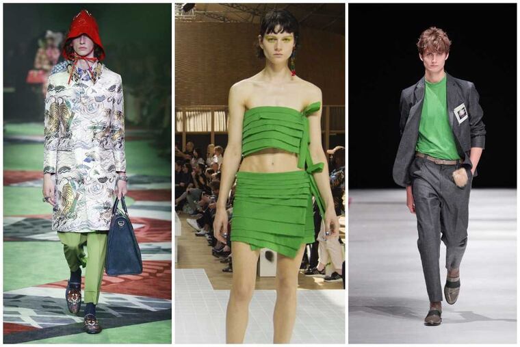
2017's color of the year - Greenery - can heal a divided America
In what appears to be yet another attempt by the fashion gods to steer us toward peace, nature and genderlessness, the Pantone Color Institute released its 2017 color of the year Thursday morning.

In what appears to be yet another attempt by the fashion gods to steer us toward peace, nature, and genderlessness, Pantone Color Institute released its 2017 color of the year Thursday morning.
Its name: Greenery.
We know this tangy, apple-green hue quite well. It's the color of a dewy blade of grass in the early morning, key limes, fresh mint, and yes, healthy green smoothies.
This is the shade of rebirth and unity. For Christians, it's one of the colors of the Resurrection. For the spiritual, it's love in full bloom - the vibrant heart chakra.
"Greenery bursts forth in 2017 to provide us with the hope we collectively yearn for amid a complex social and political landscape," said Leatrice Eiseman, executive director of the New Jersey-based Pantone Color Institute. "Satisfying our growing desire to rejuvenate, revitalize, and unite, Greenery symbolizes the reconnection we seek with nature, one another, and a larger purpose."
In other words, maybe this particular shade of green - this color of love, nature, and unity - can just maybe help us work on healing a divided America. That's a lofty job for a color.
Last year, Pantone for the first time picked two colors of the year: a soft pink called Rose Quartz and a sky blue named Serenity. Pantone defined these colors, too, as hues of hope and change, signs that collectively we were being mindful.
Pantone representatives clearly honed in on similar vibes from 2016 runways, automobile showrooms, home decor, and technology trends in choosing the 2017 springtime green as a color of hope, not to mention, it's neither male nor female. (This is the shade of green parents paint a baby's room when they've opted not to find out the gender.)
It's the color of health (read: health care that's dominating the news), and according to Pantone, apps and websites are incorporating this hue in their logos - it is the green of the balloons in the popular smartphone game Panda Pop.
The color forecasting company also says Greenery speaks to travel and new experiences. That's why Pantone partnered with Airbnb, which will create a place to stay that will feature Greenery prominently.
"It's a modern version of green," said Michele Plachter, owner of the Center City home and design firm Michele Plachter Designs, who said the color is versatile. One can paint an entire room the cool shade to create a tranquil vibe. And the same shade can give a vanilla space some surprise pop.
"It's a great transition color ... that exudes freshness and sunshine. You can bring a little bit of the outside inside."
This year's high-fashion runways were replete with vintage 1930s, '70s, and '80s looks, so it was a color of glamour, funk, and pop on Gucci, Kenzo, Michael Kors, and Zac Posen's runways. It works on Lilly Pulitzer and appears ladylike on a tote carried by a member of the African American sorority Alpha Kappa Alpha.
On Instagram, Pinterest, and around town, daring fashionistas dyed the tops of their mohawks the almost-neon green. It was also a popular mani/pedi shade as companies from Butter London to Essie incorporated it in many collections.
In other words, Greenery is both preppy and daring.
"Greenery offers us self-assurance and boldness to live life on our own terms," Eiseman said. "During a time when we are redefining what makes us successful and happy."
The earthy hue of green has been enjoying a quiet resurgence with Philadelphia-based creatives, too. Wynnewood handbag designer Jeffrey Levinson sells one of his pearlesque clutches in this grassy green. (The bag, carried on celebrity red carpets, is getting some traction at Neiman Marcus now.)
And a slightly more chartreuse version of the hue is a featured stone in a statement ring by the Philly-based jewelry company Lagos.
This is the green that makeup artist Ursula Augustine used for an accent wall in her Rittenhouse Square studio. Coincidentally, Augustine's spring 2017 makeup line features the shade in eyeliners, shadows, and mascaras.
But despite its popularity, Greenery - with its slight yellow tinge - is not the easiest color to wear. At times, it can look putrid.
"You have to find the shade of the green that works for you," Augustine said. "You might have to go more olive or even blue, but there is a green out there for everyone."
215-854-2704
@ewellingtonphl