Mirror, Mirror: Juicy!
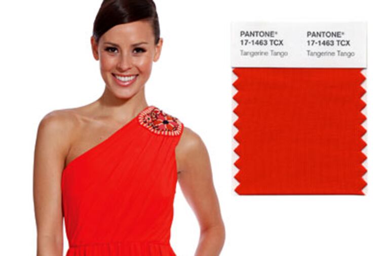
Time for an orange flush: The color of the year is Tangerine Tango, a bold hue shimmying with crimson, yellow.

It appears our warm-hued friend orange will color our world next year beyond the season of candy corn, cornucopias, and clementines.
The color czars at Pantone last week named Tangerine Tango (or red-orange in the Crayola box) as the 2012 Color of the Year.
Tangerine Tango is a specific mix of crimson with a dash of yellow. Commonly found in sunsets and Hermès prints, it will likely spice up our wardrobes, automobiles, and home decor in coming months.
"Tangerine Tango takes on the spirit of red with the warmth and cheerfulness of yellow," explained Leatrice Eiseman, executive director of the New Jersey-based Pantone Color Institute.
"It's vivacious. It's magnetic. It has that spurt of energy that we need in an era that is filled with malaise and concern. It gives us something to smile about."
Eiseman pointed to the ready-to-wear spring 2012 collections of Valentino, Elie Tahari, Nanette Lepore, Chloe, and Derek Lam as proof that the punchy shade is on the horizon in both men and women's wear.
She also noted a Jonathan Adler couch and a digital camera from Sony. And in March, Sephora will launch a color-of-the-year beauty collection featuring eye shadows, lipsticks, lip glosses, and nail polishes in the burning shade.
Orange lipstick is already selling well locally. "My number-one-selling lipstick is Micro Melon," said Ursula Augustine, owner of Rittenhouse Square makeup studio Ursula's About Phace. "It's an orangey, tangerine lipstick that looks good on everybody."
Not long ago, Eiseman said, orange was considered, loud. Tacky, even.
"It used to be considered a fast-food color," she said. "But now it's bold and rich."
These days we see orange and think Prius, ING Direct, Firefox, even Center City Sips. Could Tangerine Tango be the new color of money?
Orange will be popular this year because our interest in fashion, culture, and lifestyle is based on global trends, Eiseman said. As fashion designers find their inspiration from Africa and India, bold colors, especially those in the red family, become more important. It can even be considered a calming color, she said. After all, Buddhists wear orange robes.
Fashion is following the citrusy suit.
"I just sold out of a reddish-orange long-sleeved soft sweatshirt-like top by Vince," said Pam Katz, owner of Main Line boutique First Impressions. "We are having a red fall and we are going to have an orange spring."
A look at Pantone's top color from the last four years reveals a palette that pops. The 2011 pick was a reddish-pink called Honeysuckle. In 2010, turquoise won top hue honor. Mimosa, a warm shade of yellow, was the 2009 choice.
"The last thing we've wanted to do is present a color like gray to the world," Eiseman said. "We all have concerns, but we've wanted to lift people up, make them feel better."
But this year the nod to the impending orange infusion feels more indicative of a burgeoning trend, especially during a fashion year that featured outfits layered in jewel tones. We celebrated unusual color combinations in 2011, from the blinding Versace at H&M pieces to the multicolored zigzags of the Missoni for Target line that were so popular that demand crashed the Target website on release day.
Vibrant reds, blues, purples, yellows (and yes, oranges) became our neutrals as we colorblocked this fall, pairing classic pencil skirts and skinny pants with blouses and blazers in contrasting shades.
"The silhouettes were a nod to the past, but the bright colors helped us bring these looks to the present," explained Natalie Nixon, director of the fashion industry management program at Philadelphia University.
"It's comforting, but at the same time it's optimistic and enthusiastic."
Orange is Pantone's color of the year, but that doesn't mean the shade cancels all other brights. Mint green (Margarita), navy blue (Sodalite Blue), and sunshine yellow (Solar Power) are also mentioned in Pantone's Spring 2012 Fashion Color Report.
And then there is red. As evidenced in Hollywood red lipstick, red J Brand skinny trousers, and innumerable home furnishings, red was a big deal in 2011.
That didn't go unnoticed by international paint company AkzoNobel. In November, the company named the blushing Terra Cotta Rose as its color of the year for 2012.
"This year, we are focusing on possibilities," said Barbara Richardson, director of color marketing at AkzoNobel. "This is not a bold, in-your-face fire-engine red but a more sophisticated subtle and warm red . . . almost the color of tomato soup."
So, Richardson says, as red accent walls and washing machines and cellphones brighten up our lives personally, we can expect even the blandest corporate entities to go colorful.
We are seeing evidence of that in Philadelphia already.
This year, Philadelphia-based marketing company LevLane persuaded Beneficial Bank to go with a bright, almost cobalt blue as part of its marketing campaign.
"In an economy where clients aren't spending a lot of money on fancy photography, color is a way to get attention," explained Deborah Racano, creative director of LevLane. "I think people are trying to attract attention in different ways and they are using colors to brand themselves."
Here's to a bold new year.