Mirror, Mirror: Put your money on pink
And the color of the year is - honeysuckle, a hot hue of hope. Have a healthy whiff.

Honeysuckle reminds me of my grandmother's dining room. When I was a little girl, the sweet scent wafted from her backyard through the screen door, signaling the first full days of spring. The yellow flower reminds me of a simpler time and Sunday dinners.
But now the Pantone Color Institute wants me to associate honeysuckle with high fashion. And they want me, and likely every other Northeasterner, to forget about my memories of the plant's yellow flowers, and channel the color found on its pink cousin from southern Russia.
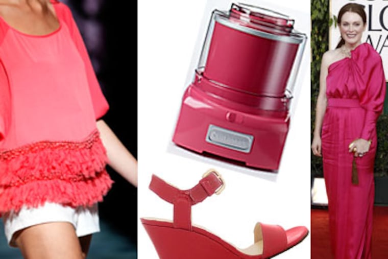
That honeysuckle is a punchy pink that is now the fashion and home-decor color of the year, as voted on by members of the New Jersey-based Pantone Color Institute, dousing everything from Stuart Weitzman sandals to Cuisinart ice-cream makers.
"It's a color that's adrenaline-pumping and at the same time lifts people's spirits," said Leatrice Eiseman, executive director of the institute. "We are in a serious time, but there is still hope."
Springs of late have featured colorless nudes on the runways, but Pantone's pick - neither baby room nor '80s neon - was a top hue in spring 2011 collections displayed at New York Fashion Week.
Shaun Kearney, the designer for Cynthia Steffe, played with the shade in his floral shifts. Eveningwear designers Mark Badgley and James Mischka worked the powerful pink into their womenswear line, as did Peter Som, Nanette Lepore, and Adam Lippes.
The color even got a nod from Julianne Moore, who donned a radiant honeysuckle gown by Calvin Klein's Francisco Costa at last week's Golden Globes.
"It's an all-engaging color that produces a healthy glow," Eiseman said.
Local boutique owners must agree, as witnessed by the many store windows that sprinkled the pink into early spring displays - a bright distraction in all this snowy weather.
Lacoste is featuring the color as one of about six new shades of collared polo shirts for men and women. A pink-and-red-striped shirt almost yells at passersby from the second-floor window of H&M on Walnut Street. And a pretty honeysuckle cashmere sweater in Knit Wit's window lured me into the store.
Even at Joan Shepp, where black rules season after season, honeysuckle has quietly found its place. The shade was rather dazzling on a horizontal color-block dress by Sonia Rykiel (pink, tan, and black) and demure in a floral-print Balenciaga shift.
"You wouldn't catch me dead in yellow or bright blue, but I'd wear honeysuckle," co-owner Ellen Shepp said. "But honeysuckle is bright and not loud, so people who wear neutrals can wear it. It's really flattering to the body."
Candice Caprice, owner of Media's Per Lei Boutique, says she's seeing it in collections by Tibi, Trina Turk, and Diane von Furstenberg. The easiest way to wear it, she says, is paired with gray.
But unlike past seasons, when only one poppy shade ruled in a sea of basics and neutrals (last year, Pantone's color of the year was turquoise), honeysuckle acts more like the lead singer in a high-pigment group of backup singers that include peapod green, beeswax yellow, regatta blue, blue curacao, lavender, russet, and coral rose. (Coral rose was the color of Golden Globe fashion plate Claire Danes, who also wore a Calvin Klein gown. Costa is definitely on to something.)
So it's not that the shades are new - it's that together they form an acceptable combination. So you can wear shades next to each other on the color wheel - like red, coral rose, and honeysuckle - or secondary colors together, like turquoise, peapod green, and honeysuckle.
"We are seeing a mixture of oranges and pinks, blues and greens," said Donna Schroeder, color and design manager for paint company Pratt & Lambert, " . . . colors that were reserved as colors that pop, not colors that can be worn all at the same time. Now the neutrals and the primaries are used for contrast."
Perhaps you think you've seen a lot of pink this millennium?
Part of the recent obsession is economic: Designers are trying to persuade us to go shopping. If you have a closet of timeless black, you'll need to update with trendy pink. At least for the last five seasons they have been offering us new colors, and shoppers refuse to think outside the black box.
Here's a free piece of advice when it comes to stores trying to urge men to pink it up. Maybe pink will pass for a pocket square or in ties, but most of the men I know would growl at you if you offered them a pink polo shirt (take note, Lacoste) - even if you layer it under blue.
The truth is, Pantone isn't really responsible for the pink-pushing. The last time a shade of pink made the color of the year was 2001, when fuchsia rose made the big time.
What's the difference between the two?
"This pink is a grown-up pink," Eiseman said. "It's not an anxious, childish, overindulgent pink of the early millennium. This pink is excitement and at the same time has a grounding quality."
OK, but next year, can we shake it up a bit? Maybe go for something hot and futuristic. Silver?