Women's soccer team designs decoration of . . .
The new Philadelphia Independence women's pro soccer team has introduced its logo and team flag and the designs are intended to represent many facets of the team and the community for which it will play.
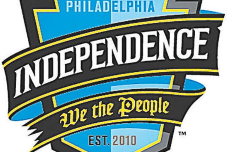
The new Philadelphia Independence women's pro soccer team has introduced its logo and team flag and the designs are intended to represent many facets of the team and the community for which it will play.
On the logo, the city the team represents, Philadelphia, and the year the team will debut, 2010, are etched onto a shield in the shape of a stylized keystone. Some of the most famous soccer clubs in the world use the shield as their badge, and the keystone is the central, wedge-shaped stone in an arch that keeps all the other stones in place. Pennsylvania earned its designation as the Keystone State during the colonial period, and Independence officials said they had combined the soccer battle shield and the image of the keystone in team colors - yellow, gray, and blue - to represent "strength, power, and patriotism - exactly like the fans of Philadelphia."
Curling around the shield is a battle-torn banner that - like the flag, below - is emblazoned with the Independence name and team motto, "We the People." The war-torn banner, team officials said, is "reminiscent of 18th-century battle emblems and serves as an icon of the Independence spirit: aggressive, united, and perseverant." "We the People," team officials said, was chosen as the motto because, "as the first words to our Constitution, this phrase unites the country and guarantees its citizens empowerment and protection. We believe with the help and support of the fans, the banner ornamented with the 'We the People' maxim will become a common sight in the stands at Independence matches."