Galleries: The sounds of color
W riting and music have much in common, but the similarities that emerge when the two forms of communication are translated into graphic systems of color, as seen in the pairing of paintings by Gerard Brown and Melinda Steffy in "Chromography: Writing in Color" at Rowan University Art Gallery, are remarkable.
Writing and music have much in common, but the similarities that emerge when the two forms of communication are translated into graphic systems of color, as seen in the pairing of paintings by Gerard Brown and Melinda Steffy in "Chromography: Writing in Color" at Rowan University Art Gallery, are remarkable.
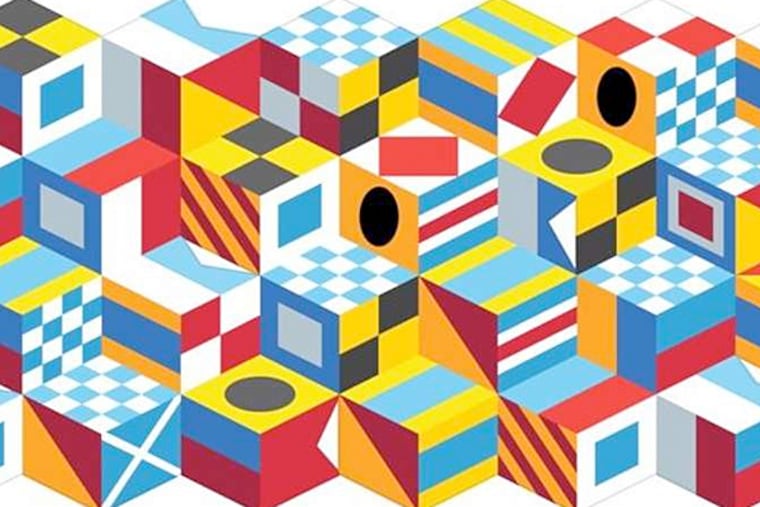
Brown, a writer and a painter, has transformed writings by Robert Smithson, Judith Butler, Edith Wharton, and Richard Dawkins into his own paintings and prints of nautical signal flags arranged in tumbling-block patterns common to quilting. The optical illusion of three-dimensional space created by the tumbling-block pattern in his works makes them object-like, while the codes and their repetitions seem to reveal a particular writer's idiosyncratic style.
In Brown's print After Edith Wharton (In reality they all lived in a kind of hieroglyphic world), for example, his complex arrangement of flags actually does suggest what you might expect a color-coded interpretation of Wharton's gimlet-eyed observation of late-19th-century New York society to look like: angular, with a staccato rhythm.
A classically trained musician as well as an artist, Steffy translates musical compositions by J.S. Bach and Béla Bartók into watercolor paintings on paper through a system in which she matches notes of the chromatic (musical) scale with hues on the color wheel. Her painted iteration of Bach's Prelude in C Major (Prelude in C Major (red), No. 1) is a steeply vertical grid of pulsing red, green, yellow, blue, orange, and violet squares in a measured pace of repetitions and subtle shifts of color.
By contrast, for Bartók's suite of piano music, Mikrokosmos, Steffy chose to echo the "little worlds" of the title, using a circular system to lay out the right- and left-hand lines of music. Her rainbow-hued version of Bartók's Parallel Motion, No. 11 looks like a Marcel Duchamp roto-relief as painted by Lucas Samaras.
Brown and Steffy have collaborated, too. The Hours, an experiment in translation that appears as a set of books on a shelf and as decals on the gallery's outside windows, is too complicated to explain adequately here.
It involves using a language invented by the French composer François Sudre (1787-1862), Brown's translations of sentences from moody literary works describing times of day (think Mary Shelley's Frankenstein, Bram Stoker's Dracula, O. Henry's The Four Million, and David Foster Wallace's Infinite Jest) into that language and then into melodies, and Steffy's re-scoring of those melodies into watercolors. It's a less visually engaging effort than their separate investigations, but it's weirdly fun, like going to a séance.
Delete QWERTY
Speaking of secret codes, the Slought Foundation is having the first exhibition of Paul Chan's 20-part series of prints from 2000-05, "Alternumerics," made using Chan's own fonts made up of textual and graphic fragments. Helvetica and Times Roman they are not. The series is in the collection of Peter and Mari Shaw, who have loaned it for this exhibition.
While Chan's esoteric arrangements of words, symbols, and doodles can be said to follow themes - desire and sexuality are prominent - they are most appealing for the way they've transformed the typing of traditional keyboard letters into a kind of unpredictable, sometimes scary, perfrmance. As he himself has written of the fairly explicit words and phrases arranged in a grid above conventional alphanumeric symbols in his alternumeric print Sexual Healing/Shift for harassment (truetype font and screenprint, 2001), "Lowercase letters are phrases taken from popular love songs of the '70s, '80s, and '90s. Uppercase letters are phrases taken from transcripts of sexual harassment cases in the United States from the '70s, '80s, and '90s. Numbers and symbols are words that heighten the tension between the play of the uppercase and lowercase letters as they shift between the voice of pleasure and the voice of violence."
You, too, can use Chan's fonts through Thursday. Originally downloadable though his former website, National Philistine, the alternumerics fonts are now available through Slought - slought.org/media/files/paulchan_alternumerics_fontarchive.zip - for the duration of his show.