Phillies, Eagles in virtual tie for best logo
We asked what you thought of the logos of the local teams, and the Phillies and Eagles finished in a virtual dead heat.
We asked what you thought of the logos of the local teams, and the Phillies and Eagles finished in a virtual dead heat.
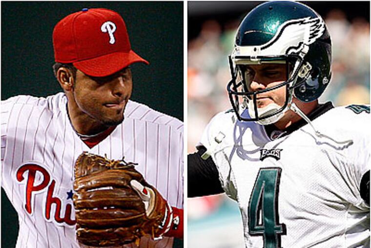
In a recent survey of Philadelphia sports fans the Daily News conducted with Temple University's Sport Industry Research Center, the logos of the Phillies and Eagles each garnered 30 percent of the vote. The race was so close it came down to two votes. The Flyers were third with 26 percent, with the Sixers at 7 percent and the Union at 6 percent.
But we also wondered what an expert thought of the logos, so we contacted Matthew T. O'Rourke, the art director for the Philadelphia-based Bowhaus Design Groupe (www.bowhausdesign.com).
O'Rourke said an effective logo incorporates the use of iconography, typography and color scheme "to create a positive lasting impression in the minds of consumers."
Given that criteria, we asked O'Rourke to rank the logos. Here is his list:
1. Eagles
"A very nice and modern logo mark," O'Rourke said. "It is instantly identifiable, even without the words 'Philadelphia Eagles.' The subtle lightning bolt gives this logo a dynamic - even electric - feeling. This logo is also strong because it is of an animal that embodies so many positive attributes - strength, speed, and most of all, freedom, which is a strong tie to the city of Philadelphia. The subtle use of green in conjunction with tints of gray give this logo a metallic feel, which is a nice touch."
2. Phillies
"A good example of a more vintage-looking logo identity," O'Rourke said. "It is a logotype or ligature, meaning it has no icon but is type-based. The font is an informal script that draws on our place in U.S. history through its use of red, white and blue and stars. The 'P' in this logo is also a very effective standalone icon."
3. Sixers
"In many ways similar to the Phillies in terms of color scheme and the use of the 13 stars," O'Rourke said. "Unlike the Phillies, this retro-looking logo is enclosed in a circle and marries basketball [literally] with patriotism. One flaw is that the stars over the '7' are so small that they tend to get lost when the logo is scaled down to a very small size."
4. Flyers
"This is a well-constructed logo mark," O'Rourke said. "It does a nice job of tying in the 'P' from Philadelphia with the concept of motion through its use of feathers. I also like the use of the orange dot to give the logo an added visual pop. As a mark, this one is on the heavy side. One could argue that something represents the word 'Flyers' should be sleek and agile, not bold. The biggest issue with this mark is that it does not have the emotional connections that some of the team logos have, because it is more abstract. In the end, it is just a really good-looking emblem."
5. Union
"Somewhat reminiscent of the Oakland Raiders emblem," O'Rourke said. "I like the style of the snake - derived from a political cartoon by Benjamin Franklin - as it is very simplified [and easy to reproduce]. The use of the shield is also a nice touch, as it encapsulates the snake [like a police badge]. The color scheme is a little heavy for my liking. The logo downplays the team name 'Union,' and emphasizes the city name, which is unorthodox. Overall, I think it has a few too many visual elements." *