‘I notice your oeuvre is monochromatic’ | Scene Through the Lens
Staff photographer Tom Gralish blogs about his work, looking at black and white vs. color photography.
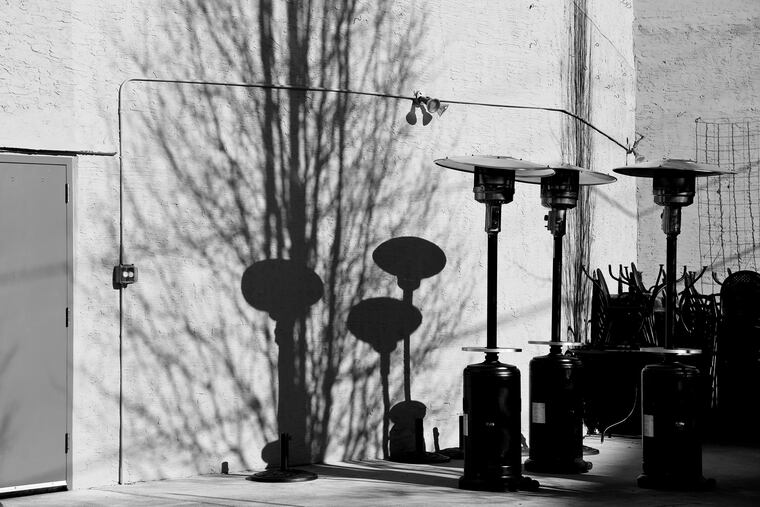
All the photos I shoot for the newspaper are in color, although most of them over the years have been published in black and white. All of the photos with my weekly “Scene Through the Lens” column appear that way every Monday. Sometimes they look really different than what I saw when I clicked the shutter. Like last week’s photo above. Most of the time though, nothing really gets lost in the translation. Like this week’s photo:
Which is why I update the photos in color in a gallery of the dozen or so latest images from the column:
When color first came to the Inquirer in the mid-90s (we had been publishing color photos in the rotogravure Sunday magazine for decades) many editors and reporters at the newspaper worried that color pictures would cheapen or sensationalize our news product. All the bright colors might distract from the subject. There was talk of the “tradition” of black and white documentary photography (the paper had won two photography Pulitzer Prizes with monochrome images). But the senior leadership reassured the assembled journalists at one of our early meetings that, “just because we can use color doesn’t mean we have to. We can still run a photo in black and white if the subject or sensibility demands it.” Of course, once everyone got over their fear of color, like with most things, we got used to it and I never heard of that action ever being taken.
Over the years, our photographers have sometimes made the deliberate decision to shoot in black and white. It’s an aesthetic choice, most often made when dealing with “street photography.” My colleague David Maialetti has been shooting in black and white with his iPhone since the first Hipstamatic apps showed up. In 2013 Forbes named him of the “10 Instagram Photographers You Should Follow.” He’s still at it, but his feed now has more color in it.
During the time I worked as an editor the paper maked the 50th anniversary of WWII with vintage photos from our own photo morgue (library) and I often butted heads with other editors who wanted to run the pictures of people and places in Philadelphia during the 1940s as sepia toned. I argued that photographers shot the pictures in tones of black and white and grey, and just because sometimes the newspaper did not properly wash and “fix” their prints and they deteriorated did not mean that’s they way they “looked.” Even during the Civil War photographers were able to make pictures with real black tones. Just look at Civil War images at the National Archives. Sepia became popular in the 1880s because it was an easier and cheaper way to preserve prints by converting the metallic silver to a Sepia compound, slowing down the aging of a photograph. By WWI soldiers and civilians where taking pictures with Kodak Brownies and getting back 2-1/4 inch prints that didn’t fade.
The headline above is from a Calvin and Hobbes strip from the 1980s, where cartoonist Blll Watterson has Calvin making snowmen when Hobbes asks, “How’s your snow art progressing? To which Calvin replies: “I’ve moved into abstraction." Then Hobbes comes back with, “I notice your oeuvre is monochromatic." For the kicker, Calvin ends the conversation: “C’mon, it’s just snow.”