The best jersey ever worn by a Philly team? You tell us.
From fan-favorite kelly green to those classic red pinstripes, we offer up 20 of the most unique jerseys in our city's history.
Wearing your favorite team’s jersey transforms you — turning your body into a living, breathing shrine to the team you devote your fandom to.
Or, maybe they just look cool.
Jerseys are culture. We grow to love uniforms just as much as the players in them. What originates as playing equipment can quickly morph into a fashion statement if the design resonates.
Franchises look to build a sense of unity by creating uniforms that fans are proud to wear in their everyday life. They serve as era-defining symbols.
Throughout decades of Philly sports, we’ve seen a vast collection of jerseys come and go — some beloved and others we wish we could forget.
From red, white, and blue to kelly green, the uniforms donned by Philly teams have captivated us for generations. But which uniform is Philly’s favorite? We want to know.
The Inquirer has put together a list of 20 designs from the Eagles, Phillies, Sixers and Flyers. Review the uniforms below and rank them to help us name Philly’s all-time favorite jersey.
To vet our list, we visited Lynn Bloom, the director of authentics and archives for Mitchell & Ness and a Delaware County native.
Bloom, who’s been with the company in a variety of roles since 2001, is responsible for researching historic jerseys and working with the sales team to determine which uniforms the store will recreate and sell.
GET TO KNOW: Lynn Bloom
From:
Lansdowne, Pa.
Favorite team at the moment:
Sixers ... but she loves all Philly teams.
All-time favorite Philly athlete:
Allen Iverson
Favorite Philly jersey:
Favorite thing about working for Mitchell & Ness:
The history
We leaned on Bloom’s expertise to provide you with some background as you rank the uniforms. See what she had to say about each of the 20 jerseys on our list.
Phillies: Pinstripes
Bloom: “It hasn’t changed much in many years which I like. I like the consistency and I like the pinstripes. My favorite thing about this jersey — and you can’t necessarily see it in photos — but their wordmark across the front is chain stitched. The quality of it is just so great. I really like the logo treatment on this jersey more than anything else.”
Phillies: Off-white alternates
Bloom: “It honors a team from the past so I like that. I like the Phillies wordmark. I’m a fan of this one.”
Phillies: ’70′s/'80′s home white
Bloom: “I like the consistency of the pinstripes and the 'P' logo. It was always one of my favorites so this feels very classic baseball and very classic Phillies.”
Phillies: Powder blues
Bloom: “I love it, everything about it. It has the button-front version, but there’s also a zip-front version which I think I prefer just for the uniqueness of it. But the logo, the 'P' is so classic and just the rib down the side. It’s just one of the best jerseys. Everybody loves that jersey."
Phillies: ‘Saturday Night Special'
Bloom: “It’s fun. I like that they did it for one night. I understand why the players didn’t love it. It’s not a great look. I’m thrilled the Phillies are bringing it back for one night. The fact that it has legendary status essentially at this point after only being worn that one time is amazing.”
» READ MORE: The Phillies are bringing back the burgundy uniforms that were so ugly the players trashed them
Eagles modern-day white
Bloom: “I like the white Eagles jerseys, but like a lot of Eagles fans, I wish the green was kelly green. I don’t love this green color. I don’t think I’m alone in that.”
Eagles midnight green
Bloom: “I don’t love the shade of green. But besides that, I think it’s a nice jersey.”
Eagles: ‘Back in black’
Bloom: “I don’t love it. It’s still not my favorite thing. The Eagles are green. I know a lot of teams adopted an alternate black jersey and I understand that. It’s not my favorite thing. I prefer to stick with the team colors, but I know that the black looks good on the field and people seem to respond to it.”
Eagles: Kelly green
Bloom: “There we go! I love it. The fact that it’s very simple, just the green, the numbers, and the two Eagles logos on the sleeve. Classic. Beautiful. One of my favorites.”
» READ MORE: Why the Eagles can’t wear kelly green
Eagles: ’70s/'80s striped sleeves
Bloom: “This one to me is really unique because of the crazy sleeve stripe pattern. I mean, you really don’t see a lot of, as you can see there’s different size stripes. It’s pretty unique in that way so that’s really what I like about this one.”
Eagles: ‘Yellow Jackets’ throwback
Bloom: “It was a nice idea — a nice nod to the city, the history, the colors of Philadelphia sort of that blue and yellow. I appreciate the history and the fact that they were educating people about the history of the franchise and the history of the city. It doesn’t feel like Eagles to me, but I thought it was fun.”
Flyers: Present-day orange
Bloom: “It looks a lot like what they wore in the 70′s which is really one of my favorite hockey jerseys.”
Flyers: 2012 Winter Classic
Bloom: “I love the lace neck on hockey jerseys. Being a history person, it’s not really historically accurate for the Flyers. They never really wore that look. Bruins. Rangers. Other teams did. But I get why they did it. I like the other shade of orange better. This slightly paler orange, I don’t like as much.”
Flyers: ‘Lindros Era’ black
Bloom: “Like I said with the Eagles wearing black, I understand why teams do it. But the Flyers have always had black as part of their logo and part of their look. So, this jersey feels to me like it was a natural addition to their offering with the orange and white. I really like this one.”
Sixers: Modern-day PHILA
Lynn Bloom: “I love the PHILA. It just feels like classic Sixers to me and like the earlier stars down the side. [The Sixers] have done really nice work and overall I think their jerseys have been a great representation of the franchise and the city.”
Sixers: ‘Iverson Era’
Bloom: “When this first came out, I wasn’t a huge fan. The Sixers were always red, white, and blue to me so when they brought in the black and the gold I wasn’t in love with it but the way that this team played and the fact that Iverson was there — now it’s only positive thoughts when I see it.”
Sixers: ’90s ‘stars and swoosh’
Lynn Bloom: “This is one of the ones that actually surprised me when people started requesting it. It’s one of those 90′s era flashy jerseys. I’ve grown to kind of love it just because it’s crazy. So ... it’s a unique one."
Sixers: ‘Championship era’ red
Bloom: “You just have to love this because it’s when they won the championship so I always have special feelings for that one. Even though it’s pretty simple, it invokes a lot of positive feelings.”
Sixers: Stars and stripes
Bloom: “I love the stars down the side. I love that the Sixers incorporated that into their current jerseys. I love the Sixers in blue as well.”
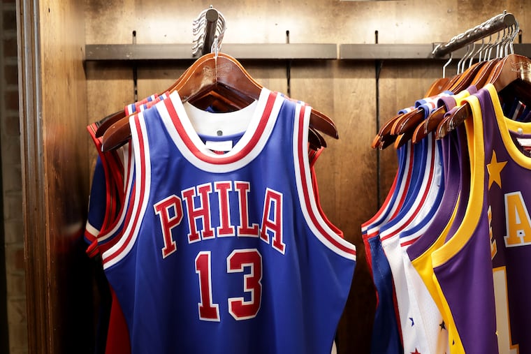
Sixers: ‘Wilt Chamberlain’ era PHILA
Bloom: “The ones that just say ‘PHILA,’ there’s something really cool about that. When Iverson wore that on the cover of SLAM, that was a big moment for [Mitchell & Ness] so I have a little bit of sentimentality towards the PHILA jersey.”
Rank the jerseys from most favorite to least.
Have a favorite we missed? Tell us in the comments.

