Finally, something to like about Trump: His handwriting | The Angry Grammarian
There's a new serif in town.
I didn’t think it was possible. But last week I managed to find usefulness, even joy, in both Donald Trump and the internet.
BuzzFeed News used snapshots of Trump’s frequently photographed handwritten notes to turn his writing into a free, downloadable font called Tiny Hand.
And as fonts go, it’s glorious.
Along with grammar, punctuation and language, typography is the crucial fourth stool leg of legibility. The right font can give your message authority, playfulness, personality, or voice. The wrong font can undermine everything you’re trying to say.
Everyone knows the most popular typefaces in history. Times New Roman takes the cake among serif fonts, also known as fonts that have little hands and feet protruding from the letters’ extremities. Helvetica is the best-known sans serif font, appearing on everything from IRS tax forms to the logo of The Office to SEPTA’s signage.
(It’s officially the holiday season, so you get a bonus typography joke: A font walks into a bar. The bartender says, “Sorry, we don’t serve your type in here.”)
After photographers captured Trump’s handwritten note, which he intended to use to defuse EU Ambassador Gordon Sondland’s impeachment testimony, the internet exploded. “I WANT NOTHING I WANT NOTHING I WANT NO QUID PRO QUO,” the note shouted in all caps.
First came the musical adaptations. But creating a free, downloadable font from the handwriting was a masterstroke.
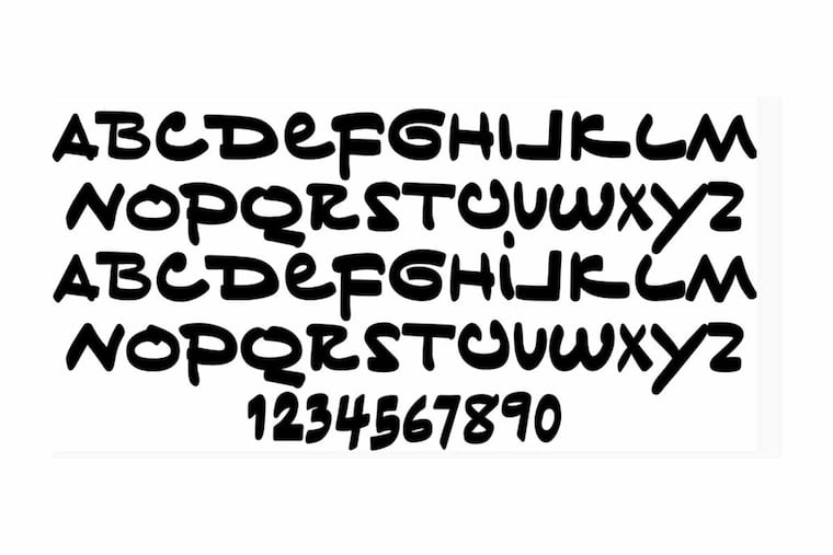
When analyzed through a typographic lens, Trump’s handwriting is far clearer than what comes out of his mouth. There’s consistency: B, D, F and P all boast a thick topline serif that suggests decisiveness and confidence. All of the capital letters are identical to lowercase ones with the exception of I, whose lowercase i has a small dot atop an otherwise carbon-copy character. The letters are thick and declarative, ensuring that the reader feels the message’s impact. There’s irony: The J has a hard 90-degree angle like a backward L, and the L’s turn is soft and gradual, like a backward J. There’s even whimsy: The Q looks like a barely closed O perched atop a cigar. It’s just weird enough to be compelling, but not so weird as to be totally illegible.
Tiny Hand blends serif and sans serif to avoid monotony. Sure, a couple of the letters don’t make sense: The U looks like a mildewy piece of paper curling up on itself, while the V has no corner to speak of. But the curlicue G and the double-wide Y are endearing enough to make me want to write the word “GAY” over and over again.
Also because, given how mercilessly the Trump administration has worked to roll back LGBTQ rights, writing “GAY” a lot in his handwriting would be ironic.
I would never use Trump’s words, but I would type with his font.
As Democrats turn up the heat, Trump should stick with his handwritten notes. Impeachment inquiry getting out of hand? Myriad associates ending up in prison? Looking increasingly like Trump broke the law in dealing with Ukraine? No worries.
There’s a new serif in town.
The Angry Grammarian, otherwise known as Jeffrey Barg, looks at how language, grammar, and punctuation shape our world, and appears biweekly. That’s every other week, not twice a week, friends. Send comments, questions and comic sans to jeff@theangrygrammarian.com.
