The surprising way SEPTA’s rebrand is going to save you time | The Angry Grammarian
Just as extraneous punctuation can screw up your reading, so too can extraneous lines on individual letters or characters.
SEPTA: Transit agency, commuter nemesis … and editors’ thirst trap?
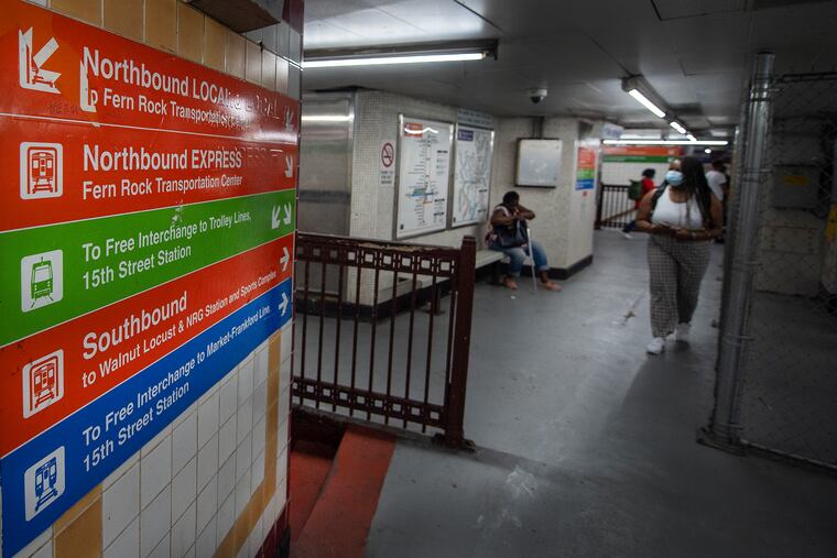
Last week SEPTA announced that, in addition to changing the names and numbers of lines across the rail network, the agency is changing all its signage to the font Roboto.
Domo arigato (i.e., “thank you very much”), SEPTA.
Fonts are like subversive punctuation. They have a profound, largely unnoticed effect on how you read. Before any word hits your eye, a designer — whose work is so intertwined with grammarians’, we ought to form a club — has decided what it should look like in order to make you, the reader, do the least amount of work. Because you’re lazy.
» READ MORE: SEPTA proposes renaming its city rail lines to help everyone get around
Take this column. If you’re reading it in print, you’re reading a serif font. Serifs are tiny extensions of letters — hands and feet that help a character stand up, making it appear sturdier, stronger. Times New Roman is the most well-known serif font, and serifs — like punctuation marks — deliberately slow down the reader, making your eye linger on each word imperceptibly longer. If you’re reading the print Inquirer, you’re probably taking your reading a little slower.
If you’re reading it online, unless you’ve deliberately instructed your browser otherwise, you’re reading a sans serif (“without serifs”) font. Online readers are scrollers who spend less time. As you scroll, a serif would create a drag on each letter, muddying your screen and making your eyes work harder. Sans serif fonts are designed to impact you less: They literally use less ink, so each character is in and out of your life faster.
It wasn’t always this way. Some of the earliest printing included serifs because most readers (most is a relative term here, given the number of people who could actually read) were used to handwriting, which serif fonts emulated. Speed wasn’t an issue.
But the ways we read have changed. We have more distractions now, and designers choose fonts accordingly to grab and hold our attention. Props to SEPTA for acknowledging this, and designing signage to make us notice it.
This move is also (metaphorically) bolder than it might appear. Old SEPTA signs — along with New York City’s subway, the Washington Metro, Chicago Transit Authority, and others — use traditional Helvetica, an industry standard for readability. While Helvetica and Roboto are both sans serif, in shifting to Roboto, SEPTA is making sure Philly does things our own way.
Font choice isn’t the only way SEPTA took steps toward readability. Recognizing that commuters are in a hurry and that infrequent riders don’t always understand existing nomenclature, they eliminated long names and gave each line a single-letter moniker: For example, the Market-Frankford Line will become just the L — pronounced the same as El, which is what most people called it anyway, for elevated train.
» READ MORE: SEPTA’s Metro plan showcases the potential of community feedback in public planning | Editorial
Calling the Market-Frankford Line the L is doing what dictionaries do: It codifies the way that people already speak. Most people think dictionaries lead, and then writers follow, but most reference books document, rather than dictate, how language is used. Likewise, everyone already called it the El even if they were traveling from 2nd to 40th, where nothing about their ride was “elevated.” Shortening it to L is more efficient.
What could be next for SEPTA? A comma in the “Dude It’s Rude” signs? SEPTA Key cards whose expiration dates read “Good Through” instead of “Good Thru”?
Dare to dream, grammar tribe. They’re getting there.
The Angry Grammarian, otherwise known as Jeffrey Barg, looks at how language, grammar, and punctuation shape our world, and appears biweekly. Send comments, questions, and the American Dream to jeff@theangrygrammarian.com.
Read more from The Angry Grammarian
Calling people ‘the unvaccinated’ could be a deadly shift in language
How the right stole ‘woke’ and turned it into a derisive insult
Banning the word ‘literally’ is George W. Bush’s next war
Are you a covidiot who coronasplains?
